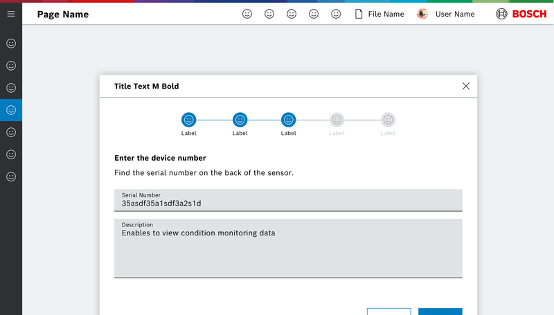
Ein Wizard enthält folgende Elemente:
- Headline
- Step Indicator
- Description
- Image (optional)
- CTA Buttons
Eigenschaften
| Name | Type | Default Value | Description |
|---|---|---|---|
hasCancel | boolean | true | Show cancel button in wizard footer |
finishButtonLabel | string | undefined | Label for finish button |
style | string | "" | Additional css styles |
handleNext | undefined | undefined |
Events
| Name | Description |
|---|---|
next | |
next | |
cancelClicked | |
finish |
Weitere dazugehörige Komponenten
WizardStep
Eigenschaften
| Name | Type | Default Value | Description |
|---|---|---|---|
id | string | undefined | unique id (within wizard context), will be generated if none given |
label | string | undefined | optional label of the StepIndicator |
iconName | string | undefined | optional icon of the StepIndicator |
disabled | boolean | undefined | Step is disabled if true |
isActive | boolean | false | if true the step is active, if several steps are set active on initialization, the last one is taken |
isBlocked | boolean | undefined | if true the step is blocked |
isValid | boolean | undefined | if false the next button will be disabled |
nextLabel | undefined | undefined | |
showPrevious | undefined | undefined | |
showNext | undefined | undefined | |
hasCancel | boolean | undefined | is tertiary button shown for this step |
cancelButtonLabel | string | undefined | tertiary button label |
cancelButtonIcon | string | undefined | tertiary button icon |
Beispiele
Wizard
Do's and Don'ts