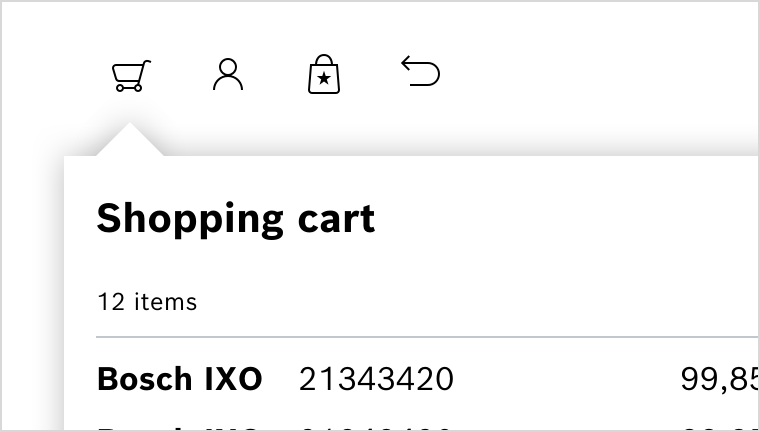
Popover sind kleine nonmodale Dialogs, die bei Bedarf vom Nutzer geöffnet werden. Meist zeigen sie zusätzliche Informationen zum Kontext an, aus dem heraus sie geöffnet werden. Sie können auch einfache Interaktionen oder Optionen enthalten.
Ein Popover tritt nur im Kontext und als Folge einer Nutzerinteraktion auf und öffnet sich an der Position des auslösenden Elements. Ein Pfeil deutet auf das Element, auf das sich das Popover bezieht. Wie nonmodale Dialogs benötigen Popover keine spezifische Nutzeraktion – sie können durch Tippen auf einen Bereich im restlichen Bildschirm geschlossen werden.
Eigenschaften
| Name | Type | Default Value | Description |
|---|---|---|---|
id | string | nanoid() | Popover ID, autogenerated if none set |
headline | string | undefined | Text when defined |
paragraph | string | undefined | Paragraph text |
hasCloseButton | boolean | false | Weather or not show close icon in the right top corner |
isDetached | boolean | true | Weather or not the popover should be detached. An attached popover will be positioned absolutely to point to a given DOM element. |
attachedTo | Element | undefined | HTML Element to anchor the Popover to |
attachmentContainer | HTMLElement | undefined | HTML Element to contain the Popover |
isPopoverArrowMissing | boolean | false | Weather or not the arrow should appear. Default is shown. |
isVisible | boolean | false | Shows/Hides the Popover |
initialPlacement | Placement | undefined | undefined | Inital Popover Placement |
arrowPlacement | Side | undefined | undefined | only exported |
alignment | Alignment | undefined | undefined | The popovers alignment on the anchor element |
height | "dynamic" | "fixed" | undefined | Wherater to stop at screen border or extend over |
width | "popover" | "full" | undefined | limited to Poovers max of 24rem or full width |
hasPadding | boolean | true | use the default 1rem padding. disable for menu and so on |
clickoutside | undefined | clickOutside | |
style | string | undefined | additional cs styles |
Beispiele
Default
No Arrow
With headline
With headline Paragraph Text View standard regular Lorem ipsum dolor sit amet, consetetur sadipscing elitr, sed diam nonumy.
With headline and close button
With close button and action
Default Slotted Button
Anchored Popover
Popover in dialog
Do's and Don'ts
Do
Popover nach Aktivierung über einen Integrated Button zur Visualisierung des Warenkorbs.