Dialog-Fenster werden benötigt, um Eingaben vom Benutzer einzuholen. Diese können modal (eine Eingabe ist erforderlich, das Fenster blockiert die Benutzung der Oberfläche) oder nonmodal auftreten (die Oberfläche außerhalb des Dialogs ist weiterhin benutzbar).
- Modal Dialogs: These dialogs are closed by default and overlay the rest of the page when opened. When a modal dialog is active, the user cannot interact with the underlying page until the dialog is closed.
- Non-Modal Dialogs: Non-modal dialogs are also closed by default but allow the user to interact with the rest of the page while the dialog is open. Please note that the Escape key does not automatically close non-modal dialogs.
- Modal-less Dialogs: Unlike the previous two types, modal-less dialogs are already opened on page load, triggered by the presence of the open attribute. However, they lack the keyboard trap functionality, meaning that the focus can move beyond the dialog area.
Eigenschaften
| Name | Type | Default Value | Description |
|---|---|---|---|
title | string | undefined | The Dialogs title |
variant | 'info' | 'success' | 'warning' | 'error' | 'super' | undefined | variant identifier, |
id | string | undefined | unique identifier, creates unique id if none given |
size | DialogSize | undefined | size of this dialog |
isModal | boolean | false | if true, show as modal |
hasCloseBtn | boolean | true | show close button if true |
label | string | undefined | The headline of the dialog box content |
dialogBody | string | undefined | The content of the dialog box, is also the default slot |
dialogCode | string | undefined | The error code of the dialog box |
isPrimaryBtnDisabled | string | false | if the primary button is disabled |
isOptionalBtnDisabled | string | false | if the optional button is disabled |
primaryBtnLabel | string | undefined | Label text for the primary button |
secondaryBtnLabel | string | undefined | Label text for the secondary button |
hasOptionalBtn | boolean | false | If set to true a third optional button will be displayed |
optionalBtnLabel | string | "" | Label text for the optional button |
isClickOutsideClose | boolean | true | set false if you want to interfere, e.g. clearing a form in a dialog or similar |
isVisible | boolean | false | show/hide the dialog |
style | string | undefined | additional styles |
Beispiele
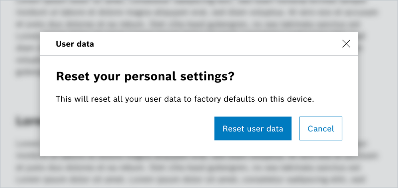
Default Modalless Dialog
Default Modal Dialog
Nested Modal Dialog
Default Modal nonModal Dialog
No Header Dialog
Scrollbar Modal Dialog
Special Modal Dialog (ohne Close- und mit Optional Button)
Info! Alert Dialoge können, wie die Default-Variante, mit und ohne Close Button verwendet werden.
Alert Dialog – Info
Alert Dialog – Success
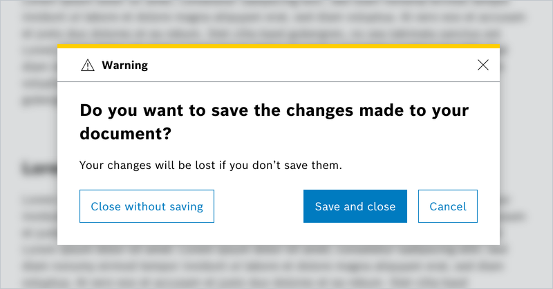
Alert Dialog – Warning
Alert Dialog – Error
Alert Dialog – Super (Tutorial)
No Header
Dialog Sizes
Do's and Don'ts
Do