- Notification bar (default) for inline display
- Notification banner
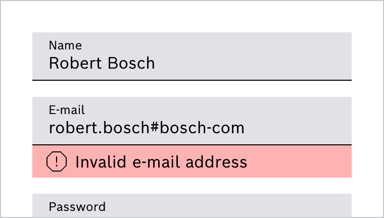
- Notification text shown in form fields
- neutral (default)
- success
- warning
- error
Eigenschaften
| Name | Type | Default Value | Description |
|---|---|---|---|
notificationId | string | undefined | Unique ID , unique id will be generated if not set. |
name | string | undefined | Name of the element |
variant | 'banner' | 'text' | undefined | optional if not passed 'bar' type will be generated. Other variants are 'banner', 'text' |
type | 'neutral' | 'success' | 'warning' | 'error' | undefined | optional default will be neutral, other types are 'success', 'warning', 'error' |
iconName | string | undefined | optional icon name will only be used when type is neutral |
content | string | undefined | Text to be displayed in the notification, this is also the default slot |
isShown | boolean | false | If variant is 'banner', show or hide the banner |
style | string | undefined | Additional css styles |
Events
| Name | Description |
|---|---|
closeClicked | If type is banner this will trigger, when the banner is dismissed/closed |
Beispiele
Notification Text
Notification texts are usually used in combination with form fields. The following example shows the combination with a text field.
See Form Field
Notification Bar
Notification Banner
Do's and Don'ts
Do
Notification Text im Formularkontext als Warning
Do
Notification Text innerhalb einer Abfrage als Zusatzinformation