Eigenschaften
| Name | Type | Default Value | Description |
|---|---|---|---|
id | string | undefined | Unique ID for the dropdown, unique id will be generated if not set. |
label | string | undefined | Label of select field |
required | boolean | false | Makes the dropdown required |
tabIndex | number | undefined | Index of sequential keyboard navigation |
disabled | boolean | undefined | Whether or not the dropdown is disabled |
ariaLabel | string | undefined | Accessibility label. Used if label doesn't exist. |
isDynamicWidth | boolean | false | Indicates that the width of the dropdown should by dynamic based on the longest option |
options | IHyperSelectItem[] | undefined | Dropdown options which can be selected by user. |
value | IHyperSelectItem | undefined | Item of options which is selected. |
isLoading | boolean | false | Show Skeleton if true |
hasEmptyOption | boolean | false | Offer an option that returns null when selected |
title | string | undefined | Appears on hover |
isStandard | boolean | true | Set false to show an downward arrow |
style | string | undefined | Additional css styles |
Beispiele
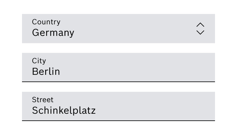
Dropdown (Standard)
Dropdown with Arrow down icon
Alternativ mit Arrow down Icon, wenn es sich nur nach unten öffnet. Kann ohne oder mit Textlabel verwendet werden.
Dropdown mit Label
Dropdown
Do's and Don'ts
Do
Verwendung eines Dropdowns mit fixierter Breite für ein harmonisches Layout